From Confusion to Clarity
Solving Fare Shock with Time-Based Pricing
Fare shock isn’t about the money. It’s about the moment.
We knew we had to explain it better, not just calculate it smarter.
We wanted to do things differently.
What if we made fare updates feel fair, not frustrating?
Other apps charged for time too — they just didn’t talk about it.


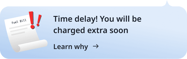
They add it. You notice it. Too late.
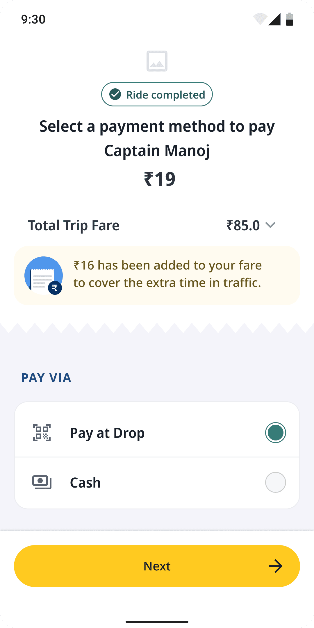
— Traffic charges,” the app told him, right after the ride ended.
— He sighed. “It’s not about the money. It’s just... I felt tricked.”
— “Why did the fare increase?”
— “But no one told me that before. Wasn’t this supposed to be ₹80?”
The fare made sense. The moment didn’t.


Let's start with a story
We spoke to a frequent cab user in Namma Bengaluru.
His ride was just 4 km — the kind he’d taken dozens of times.
But this time, it took 40 minutes instead of 15.
The fare? ₹112 instead of the usual ₹80.

He wasn’t upset about paying more.
He was upset that he didn’t see it coming.
This wasn’t about inventing a new fare system.
It was about reimagining one that already existed
— just without the confusion, the timing, and the shock.
Results
Launched in Bangalore for Auto
20%
Support tickets related to fare shock dropped significantly after launch
80%
Captains were more willing to accept rides in high-traffic zones
So, how did we do it?
Why does a necessary charge
feel unfair — just because it
came too late?
Defining the problem
For captains, the problem was simple
Longer rides in traffic meant more time, but not more earnings.
While other platforms already compensated captains for this, Rapido didn’t.
As a result, many captains avoided high-traffic areas altogether — especially during peak hours.
We knew that if we didn’t fix this, we’d eventually
- lower order acceptance
- longer wait times
- and a poor experience for everyone involved
For customers, the problem was different — but just as real
They weren’t frustrated by fare increases.
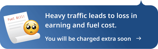
They were frustrated it was about paying without knowing why, or when it started adding up.
Every other platform made it part of the final bill.
We wanted to make it part of the journey.
5-6% of users face Time fare
≈ 200000 users daily
We had to answer two questions at once
Could we give captains what they deserved, without making riders feel blindsided?
And could we do it in a way that felt transparent, not transactional?
What we were betting on!
✓ That customers would understand the change — if we told them clearly and early
✓ That captains would accept more rides — if they knew they were fairly compensated
✓ That we could reduce fare shock — simply by bringing users into the loop
Brainstorming
Everyone is involved from the
beginning
PMs, Developers, Product Designers were involved
to build the concept.
Building the concept together was key in uniting the
team: we had a common problem to solve.

Solution
It wasn’t about what we charged. It was about when — and how — we said it.
Simply being
Empathetic
1 Homescreen

2 Banner on FE screen indicating about heavy traffic*


3 Captain search screen


3 During ride when exceeding estimated ETA*


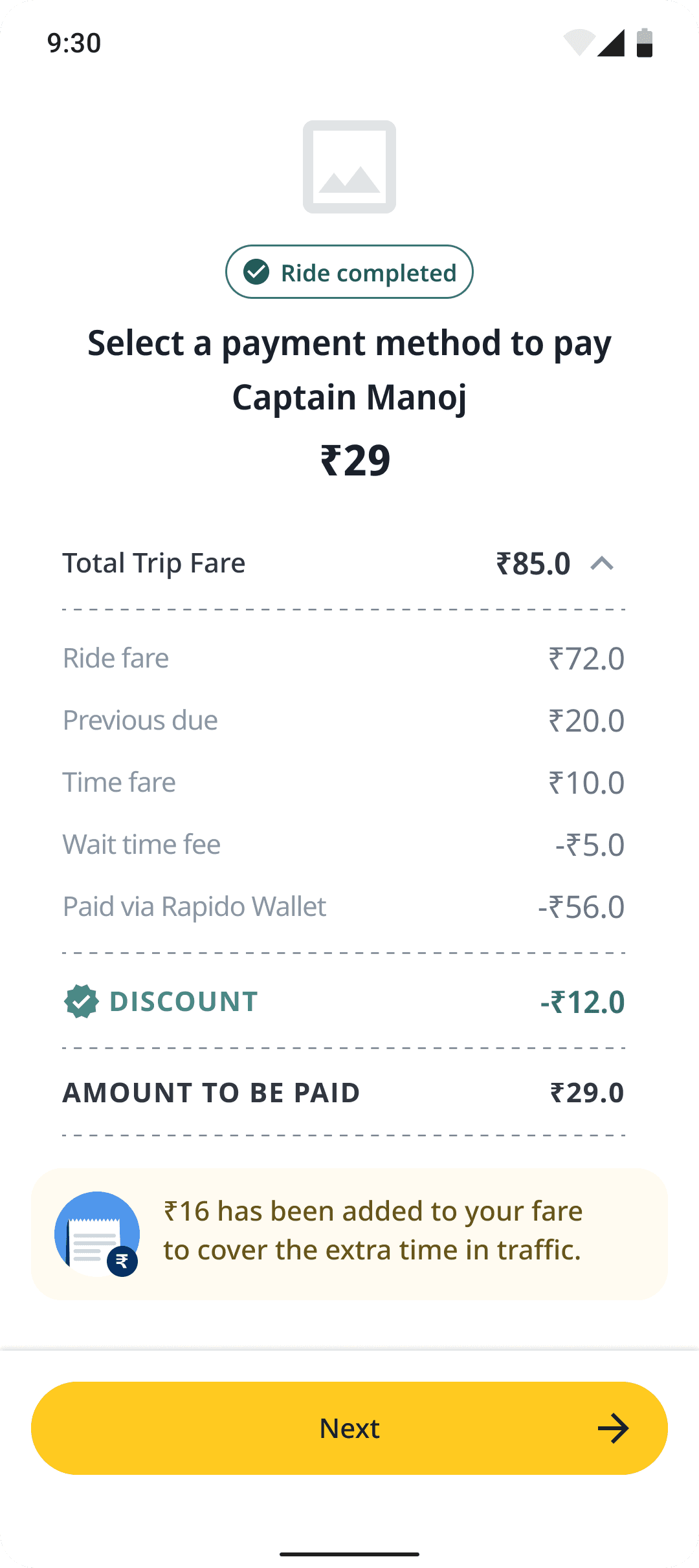
4 Payment details
An iterative process
It took us some time to land on
sometimes we were satisfied
with. Many user-tests and
rounds of feedback were necessary.
v3

v1

v2
Exploration
We’ve explored different narratives, component types and UI’s


Our approach to navigate
through deep water
Comic strip as a new visual style for bottomsheets & Goodwill narrative for copies
Visual approach
We chose comics over clean UI.
Everyone in India has grown up seeing comics — from Champak to Tintin.
They’re familiar, expressive, and make even serious topics feel light and clear.
Plan A: Comic Strip
✓ Relatable, emotionally expressive
✓ First-time in any ride-hailing app
⚠️ Untested format — could’ve gone either way
Plan B: Minimal Illustration (Traffic Light)
✓ Visually calm and modern
❌ Too abstract, less context and emotional pull
Early user tests showed higher comprehension and more impressions with comics.
So we went bold — and it worked.
Copywriting approach
We chose empathy over instructions.
Instead of telling users what changed, we made them feel why it changed.
Plan A: Goodwill Approach (Empathy)
✓ Built a connection with lines like:
“Heavy traffic means extra time on the road for your Captain.”
✓ Framed the situation without blame
✓ Made the fare feel fair
Plan B: Direct/Instructional
✓ Clear and concise
❌ Felt cold, lacked emotional impact
❌ Didn’t reduce friction — only stated the fact
It led to less friction, fewer questions, and more user understanding.

A little extra helps us keep going!
Heavy traffic on the way
slows down the ride
Leading to Longer ride time
Comic style visual
Traffic delays are not ideal, so we make sure fare is minimal.
First 10 minutes free,
time fare starts only at 3:25 PM
If delayed further, it’s ₹0.5/min but it won’t exceed ₹20.
Empathetic Copy
Version 1 was launched
Continuous iterations are going on, ad we are soon launching it in all tier 1 cities for Auto & Cab both
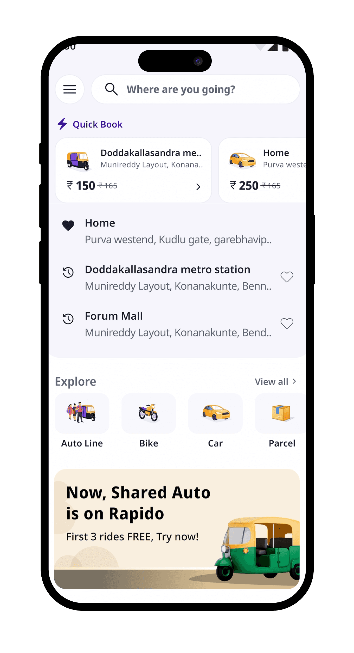
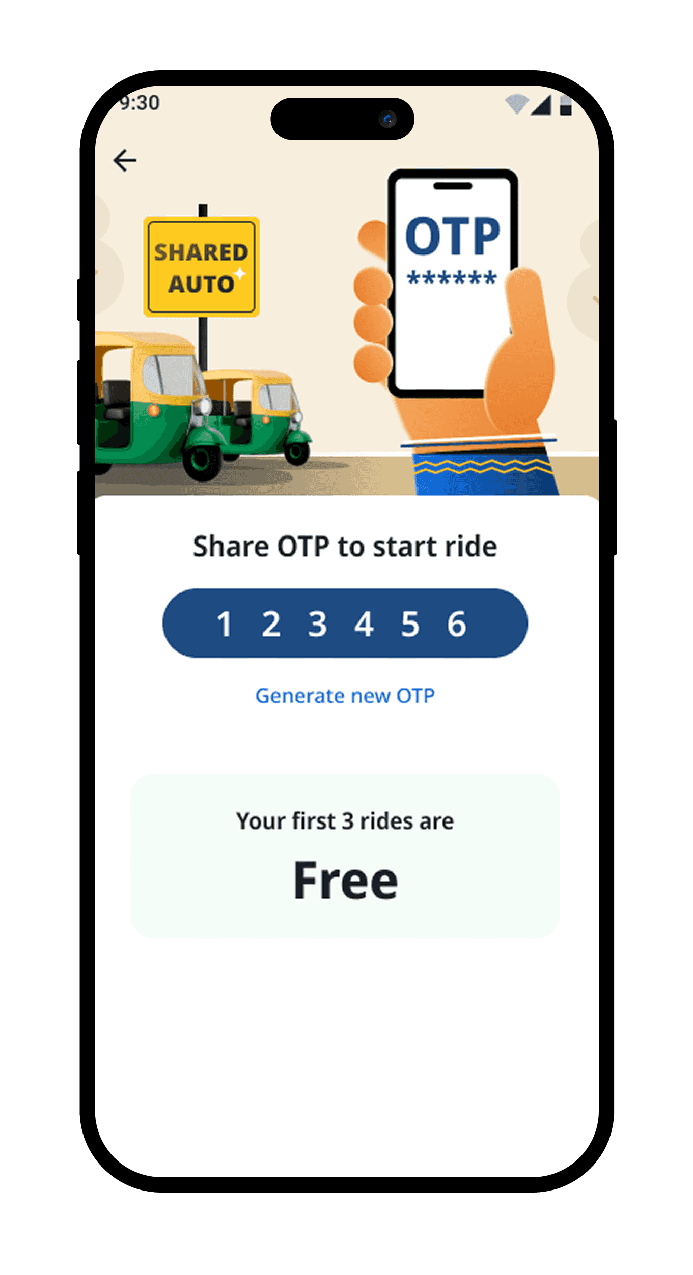
How We Built Shared Auto for Everyday India
Shared mobility works offline. We just had to earn our spot in it. We focused less on onboarding, and more on belonging.
Results: 500+ rides everyday, 20% of first time shared auto users used Rapido once in 2 weeks
Platform: Android & IOS
Case study →